A little about me..
2nd year. Majoring in English Language & Linguistics.
I find solace in long periods of
Hence, "snorlax".
(Note: That's a pokemon.)
hit counter
For starters, a photojournalists main objective would have to be identified first. A photojournalists objective is to “uncover reality” - that is, to present truth to its viewers (Ratavaara, 2009). In relation to Week 10's topic (cyborgs), a camera for a photojournalist is like an extension of their vision, thus their main goal is to transfer what they see and disseminate that image to a wider audience.
From the surface, it may seem like photography has no rights or wrongs. But, when you're dealing with an audience, adhering to the age long belief that unless its art, photographs are meant to depict reality (Ratavaara, 2009), it is a completely different issue. As there are a wide array of truths that people aren't aware of as some of them are too gory or seemingly doesn't fit in our world, brings about a set of codes, ethics, that photojournalists are supposed to adhere to. “Supposed” is used here because like the saying, “all rules are meant to be broken”.
Wright (2004) defines ethics as “a branch of philosophy that is concerned with issues of right or wrong” (p. 178). In relation to photojournalism, Wright (2004) had classified ethics that applies to media professionals under “applied ethics”. This comprises of ethics that apply in situations like in Kevin Carter's famous picture of a starving African child and the vulture that was eying it to be its next prey, for instance, when capturing a starving child, do they just leave them or..?
Wright (2004) had listed three ethics of photojournalism. They are:
1. Photograph as honestly as possible, provide accurate captions, and never intentionally distort the truth in news photographs.2. Never alter the content or meaning of news photograph, and prohibit subsequent alteration.
3. Disclose any alteration and manipulation of content or meaning in editorial feature or illustrative photographs and require the publisher to disclose that distortion of any further alteration
Quoted from: Wright, 2004, p. 180
Whereas NPPA (2011) had also listed codes of ethics for a visual journalist – in relation to this entry, a photojournalist. Some of the rules listed are as follows:
4. Do not pay sources or subjects or reward them materially for information or participation
5. Do not accept gifts, favors, or compensation from those who might seek to influence coverage.
Quoted from: NPPA, 2011
In the first rule listed above, it is fairly obvious why photojournalist should adhere to this rule. If they misrepresented truth intentionally, this would tarnish their credibility because as I have established in the beginning of this entry - a photojournalists goal is to uncover truth. Where would the truth be when bias is involved?
The second rule basically means that a photojournalist should capture images as is. Therefore, the photographer should not play any part into making a scenario that they envision. This rule does not only apply when taking the photograph. It should also apply to what happens after the photograph. Therefore, taking a picture as it is and then altering the situation would still go against this code.
Rule number 3 simply means that if photos are altered in any way, there should be a disclaimer to let the audience know that the photograph has been manipulated. Any form of manipulation, be is something as simple as changing the colour of an object in the image is still considered as altering truth - therefore, this goes against a photojournalists whole purpose.

This is a famous instance where this rule is not practiced as the difference as they are clearly the same picture but used to create different meanings.
The fourth and fifth rule stated above basically means that do not let yourself (as the photojournalist) and your subjects influence the picture you take. Meaning, as a photojournalist, you do not reward the people you are photographing to create a scenario that you wish to capture. While the fifth rule basically means, do not give in to bribery. When you are bribed, you are in one way or another influenced to take a picture that is biased in nature.
References:
NPPA. (2011). NPPA code of ethics. Retrieved from http://www.nppa.org/professional_development/business_practices/ethics.html on November 12, 2011. (*disclaimer: although .org sites are not to be fully trusted, I referred to it because Wright (2004) had also referred to NPPA in his book.)
Ratavaara, N. (2009). Ethics in photojournalism. Retrieved from http://books.google.com.bn/books?id=msTDsWhMR-MC&lpg=PA4&dq=Photojournalism%20ethics&pg=PA2#v=onepage&q&f=false on November 12, 2011. Wright, T. (2004).
The photography handbook. London: Routledge. Retrieved from http://books.google.com.bn/books?id=-fGFXROq2qoC&lpg=PP1&pg=PR4#v=onepage&q&f=false on November 12, 2011.
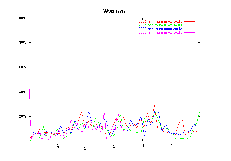
Generate an information graphic that explains the relationship among gross revenue, gross expenses, cost of fuel and cost of fuel as a percentage of expenses from the year 2000 to 2009.
First and foremost, information graphics, according to Lester (2006), is a “visual display” that comprises of data which is either tabulated or structured into diagrams aided by a text in order to tell a story to its audience (p. 176). Thus, according to this definition, an information graph has a narrative. Examples of information are line graphs, bar graphs, pie charts, etc.
The information graphic I have created for the purpose of this task is as follows:
 For a clearer version, download here.
In the formation of my information graph, I chose to represent the gross revenue and the gross expenses in the form of a bar graph. I purposely chose a bar graph because comparisons are easier to interpret when data is formulated side by side. Toor (1996) claims that bar graphs is the ideal information graph when showing comparison that can be easily understood.
However, when compared to the graph provided by Dr Chris Woo, I realized there was something I did not take into account. As the graph is supposed to represent four sets of variables, bar graphs would make the graph look too messy. The preferable type of graph would be a line chart in this case. Despite Toor's (1996) claim that the purpose of a line graph is similar to a bar graph – to present information and comparison, Achelis (2001) had identified the advantage of a line chart, that is, although it is simple, it is the easiest to understand as data is not crammed together. Therefore, as there is supposed to be three variables pertaining to cost in this graph, a line chart would be the preferred type of information graphic. However, if all the sets of data pertaining to cost were similar in value, the line graph might end up returning unfavourable results, like this:
from google images
The lines keep overlapping one another and when a lot of variables are included in a single line graph, it can end up looking too cluttered, thus this defeats the purpose of info graphics as a way to make interpreting data much easier.
When constructing my graph, I misunderstood cost of fuel and cost of fuel of as percentage of expenses to be the same. The cost of fuel is not represented in my graph, while the cost of fuel as percentage of expenses is represented with a line graph. I chose the line graph as it contrasts from the bar graph which I used to represent gross revenue and gross expenses. The main purpose of the graph is to show trend and comparison, therefore I used both the bar graph and line graph simultaneously in order to show the differences. In relation to the answer provided by Dr Chris Woo, a pictograph would have been the ideal choice as pictographs can be used to provide extra data on a line or a bar chart.
 Therefore, the basic understand of cyborgs is half human-half machine, like Frankenstein and Robocop. However, unbeknownst to us, claims are being made that we are cyborgs too!
Haraway (1991) states that “a cyborg is a cybernetic organism, a hybrid of machine and organism, a creature of social reality as well as a creature of fiction” (p. 150). Therefore, the common understanding of a cyborg, according to this definition, is accurate – half human-half machine. Basically, this means that a cyborg is an embodiment that exists in the real world, whlist functioning from a virtual reality and vice versa. At this point, you would be shaking your head in disagreement – you are all human, definitely not a machine. It's okay. I've been there too.
What was originally used as a form of escapism, has become reality – cyberspace. Humans resume a cyborgian identity as ones identity in the real world can be altered in cyberspace (Robins, 2000). In short, we use avatars to communicate. When posting comments on online communities, especially in wordpress, you are asked to choose an avatar – your “self” or “face” in online communities. I was familiarized with avatars being your “face” in online communities through wordpress. Here, an individual becomes a mesh of human and machine – human communication through a machine; thus the individual resumes a cyborgian identity. This concept is best illustrated by facebook – you posting through an avatar on facebook.
In today's world, technological devices and just basically technology is integrated with our bodies – though not always literally. We are heavily dependent on machines (technology) to go about in our daily lives. Technology can even be identified to be extensions of ourselves, similar to how eating utensils such as cutlery is used to be an extension of our hands. In a way, as the machines become an inseparable part of us, in a sense we become cyborgs. Two separate entities are merged into one to create us.
This was especially true when I started having withdrawal symptoms when I had to get my laptop fixed a while back as I treat my laptop as an extension of myself. It's not so much for leisure anymore, but just the idea of being on my laptop aimlessly surfing through the net. On a random note, this perfectly exemplifies McLuhan's statement - “the medium is the message”.
This video exemplifies our reliance on technology:
Therefore, in the spirits of admitting my cyborgian identity, using the contents from Week 6, Rhetoric, I would like to end this entry with as delusional as it may seem:
Rain fell in love with a cyborg + I am a cyborg = Rain fell in love with me.*
* reference to the Korean movie “I'm a Cyborg, But That's OK”. The lead actor in the movie is Rain.
My favourite all-time classic movie would be The Little Rascals. As a child, I watched The Little Rascals more times than I could count, to the point where I memorized the lines (though when recited, I probably sounded really incoherent being only 6 – 7 years old then).
One of the many scenes I remember until this day.
As for television shows, I have two favourites; Friends and That 70's Show.
Clip from That 70s Show
The purpose of this entry relates to the personal excerpt of my favourite television shows and movie because the question I will be answering will provide explanations as to how television and film shapes a person's identity. With “identity” being the main focus of this entry, sociological jargons will thus be utilized frequently.
With television nowadays being accessible to many, it cannot be denied that television will unconsciously effect ones behaviors and perceptions to some things – influences from television integrates itself with the construction of identity.
But, what exactly is identity? Identity is created by an individual during adolescence in order to “create a sense of self”, to distinguish themselves from others (Harris, 2003). The construction of identity begins from an early stage in life until death, and the process where one learns the norms, roles and values of their society is known as socialization (Marsh, 2005). As the process of socialization is an on-going process – therefore, identity is constantly being restructured and altered.
As individuals learn norms and values from a variety of domains - mass media, inclusive of television and film, is one of them. According to Shepard (2010), although the direct effects of mass media during socialization is not obvious, it is however said to be one of the contributing factors towards the creation of “self”. Shepard (2010) further states that this is because “the media provides information, promote social continuity and integration, supply entertainment, explain and interpret events and information” (pg. 116). Therefore, from what is portrayed through television, individuals will pick up on some characteristics portrayed by the actors and make it their own. Though this does not necessarily mean that when one watches violent movies, they will become violent too.
Personally, That 70s Show had influenced the way I interact with my friends. At times I can be quite sarcastic and I think this is due to the extensive use of sarcasm in the show. In a sense, what I watch on the television screen is transmitted to me to form a part of my identity. That however, is just a part of my identity that is influenced by television. In extreme cases, the influence of television and film is a lot more evident.
For instance in http://youtu.be/oYCew-nq-X0. The two characters in the clip are heavily influenced by Lord of the Rings, to the extent where they are able to communicate in Elvish (a language used among Elves in the story). They have assimilated the language of the Elves, and integrated it with their identity. For them to be communicating with each other in "Elvish", it suggests that to them, the influence of Lord of the Rings is so strong that it becomes an intergral part of their identity.
What exactly is the difference between captions and cut lines? They're actually almost similar as they are both used in the same place. The difference is, captions are the headlines of a cut line and a cut line is the description of an image (ku.edu, n.d.). This is similar to the concept of a newspaper, an essay, and even this blog post! The title precedes the content, however captions and cut lines are pertaining to a picture.
The term 'captions' and 'cut lines' are used interchangeably as they are basically the same if you ignore the technicalities. The purpose of a caption is to gauge the intended reaction from an audience and in the brief description, the details that are supposed to be included are answers to the who, what, where, when, why and how questions (Aggarwal, 2006). So, how do captions and cut lines re-frame the meaning of an image?
Captions and cut lines work in the same manner “anchorage” does in semiotics. To recap, “anchorage” refers to a text or a caption which builds a bridge between a picture and its intended meaning (Sellers & Gonzales, 2002). However, it does not stop here. It goes one step further as it frames the interpretation of meanings to just one thing. With reference to the Agenda Setting Theory, the captions and cut lines tells readers how to think in relation to the image, not what to think about (Griffin, 2009). To reiterate the point I made before, captions and cut lines can alter the meaning of an image as it specifies the meaning through the text below a picture.
How exactly does the agenda setting theory squeeze itself in, in this case? Agenda setting is defined as “the process where the mass media defines what we think and worry about” (Sanchez, 2002). This concept can be applied in the case of captions and cut lines because ones interpretation is reduced to something specific. One thing is highlighted from a wide array of interpretations and only one of the vast amounts of meanings become prominent. This is similar to how captions and cut lines re-frame meanings.
From a recent article, how captions and cut lines re-frame the meaning of an image:

Image taken from Liza's article from the Borneo Bulletin on Friday 11th November, 2011.
References:
Aggarwal, V. B. (2006). Essentials of practical journalism. New Delhi: Concept Publishing Company. Retrieved from http://books.google.com.bn/books?id=m7_DtngZLogC&lpg=PA80&dq=Photography%20cut%20lines%20caption&pg=PA80#v=onepage&q&f=false on November 8, 2011.
Griffin, E. (2009). A first look at communication theory (7th ed.). New York, NY: McGraw Hill.
ku.edu. (n.d.). Photo captions & cutlines. Retrieved from http://web.ku.edu/~edit/captions.html on November 8, 2011.
Sanchez, M. (2002). Agenda setting. Retrieved from http://zimmer.csufresno.edu/~johnca/spch100/7-4-agenda.htm on November 12, 2011.
Sellers,P., & Gonzales, S. (2002). The language of advertising. Retrieved from http://www.stanford.edu/class/linguist34/Unit_03/anchor-relay.htm on November 12, 2011.
 print screen from lecture slide
 From the advertisement, you can assume that it is trying to say that McDonald's serves fresh fries which is just that good. How can you reach this assumption? The advertisement does not lay it out on a silver platter to you. Instead, it makes you connect the dots. In relation to the previous entry, this would not succeed if you do not have the schema for french fries.
Another reason which can explain why the advertisement is persuasive is because of the medium it uses. This falls under the claim that rhetoric in advertising prioritizes the style over the content (McQuarrie & Philipps, 2007, p. 4). The advertisement would not be as convincing if it were disseminated via other mediums. For instance, if this were on television, it would not be as well received because the 'language' of television is different from that of print advertisements.
- French fries made from fresh from potatoes are good.
- McDonald's french fries are made from potatoes.
- Therefore, McDonald's french fries are delicious because they are made fresh from potatoes.